Roy Lichtenstein has been referred to as a forefather of Pop Art. He commercialized fine art and was called the worst artist in America because of it, yet he was one of the most consistent artists in the 20th century. He was known for his signature method of using Ben-Day dots, he invented a rotating easel so he could paint at all angles and he worked with mirrors in his studio to achieve a backwards perspective. By the midpoint of his career he was an established and successful artist and famous in his own right, but unlike some of his peers, like Warhol, he shunned the limelight and occupied himself in his studio.
Roy Lichtenstein’s Pop Art style emerged a few decades into his painting career, at the age of 37. Art historian Ernst Busche stated that Lichtenstein’s post-1961 path was unequivocally his greatest achievement. Lichtenstein produced a style of art that was bold and simplified, and his subjects were common exaggerated objects that filled his canvases. His paintings came from ideas he got from comic books, newspaper ads and even the yellow pages. His art reflected life and the American consumer culture. It also illustrated the increasingly industrial nature of America. He considered his first Pop painting to be Look Mickey (1961). Lichtenstein consciously made sure the colors looked flat and smooth to contrast the Abstract Expressionist paintings of the time. In fact, the Pop Art movement is widely interpreted as a counteraction to the ideas of Abstract Expressionism. He did not want any sign of brush marks because he wanted it to look as if it was mechanically printed. That was also the first time he used Ben-Day dots. (Named after illustrator and printer Benjamin Day.) Art Critic, Carter Ratcliff, described Lichtenstein’s way of imparting his own style onto a subject as Lichtensteinize.

Look Mickey, 1962
Washingtonian.com
Lichtenstein felt optimistic about the outcome of Look Mickey and continued to produce artwork based on comic books and newspaper ads. He started working with the established art dealer Leo Castelli. Coincidentally, Andy Warhol approached Castelli around the same time with similar comic-book paintings. Castelli recognized a new beginning in the art world, and in 1962 he promoted one of the first Pop Art exhibits ever. “In fact, Robert Rosenblum recalled that ‘for most of the world, Lichtenstein was born at the Leo Castelli Gallery in 1962, at an exhibition that dumbfounded with horror or delight everybody who saw it and that can still jolt the memory.’” (Rondeau & Wagstaff, 2012, p.39) It was a success for Lichtenstein because the show was sold-out however; the art critics were not fans of the new movement. Art critic Max Kozloff described viewing Pop art as “acid shock.” Lichtenstein, years later, reflected on the critics review and said: “New things always seem much more startling than they seem twenty years later or when they have sunk into the history of art.” (Alastair Sooke, 2013, p.24) It took several years for the critics to digest the Pop Art images, but the general public seemed to be very ready for the movement. Lichtenstein had a good sense of humor when it came to how people responded to his artwork. In fact, he condoned the Life magazine article headline “Is He the Worst Artist in the US?” Lichtenstein enjoyed the irony of the headline because Life had published an article about Jackson Pollock in 1949 with the headline asking if Pollock was the greatest painter in the U.S.
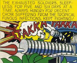
Takka Takka, 1962
Archive.com
For the next thirty-five years Lichtenstein was at the forefront of the American art world. Lichtenstein explains his process with his first Pop paintings in an interview with Diane Waldman: “To begin with, I did as many different things as I could: products and objects and girls and war, all at the same time. I worked on a variety because there were so many things to do at that time. I worked in every direction at once. Later I tended to focus more on single ideas.”(Diane Waldman, 1971, p. 25) In the early sixties, Lichtenstein began the series of paintings that he is probably most known for, weeping women and daring men. These characters were featured in romance and war comics. One of Lichtenstein’s significant war paintings is Takka Takka (1962). The machine gun is the focal point at the bottom of the painting, with a large text area at the top, and the words “Takka Takka” bisecting both of them. “Lichtenstein thus made a painting that, unlike the comic strip on which it is based, is a statement of powerful complexity.” (Diane Waldman, Guggenheim, 1993, p. 95) Once again, he recreated an everyday image and revolutionized it. Also in 1962, he painted Femme au chapeau after Picasso’s painting. “It’s interesting how Lichtenstein’s use of source material, from comics to masterworks, leaves no room in his work for value distinctions between so-called high and low culture. He approaches them both with the same rigorous attention to detail and holds neither so sacred as to leave them unmarked by his own aesthetic interests.” (Art Institute of Chicago; ARTicle Blog) These two paintings are perfect examples of his range of subject matters. He was attracted to Picasso’s work from a young age. In fact, he spoke of Picasso more often than any other artist. By around 1966, he was no longer painting comic-strip images.

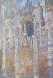
Rouen Cathedral
LACMA.org
In the 1970’s and 1980’s, his style broadened on what he had done before. He focused more on the art done by the masters of the early 20th century such as Monet, Magritte, Dali and Matisse. “He started to concentrate on paintings that were explicitly concerned with art history, such as his 1968-9 canvases based on Monet’s Haystacks and Rouen Cathedral series.” (Alastair Sooke, 2013, p.4) Surprisingly, the entire series was left to Lichtenstein’s assistants to execute however; he determined the design and color relationships and the fundamental decisions. This differed from his comic-strip paintings because he had complete control over those. “A comparison of his ‘Monets’ with the original on which they are based reveals that Lichtenstein’s version emphasizes the play of shape against shape rather than the dissolution of form in light with which Monet was concerned.” (Diane Waldman, Guggenheim, 1993, p. 146) His use of Ben-Day dots in these paintings is very different from all of his past work; it reflects a process more like Seurat.
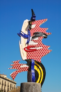
Barcelona Head, 1992
Barcelonaphotoblog.com
It has been said that Lichtenstein’s paintings speak in a vocabulary of dots. From its inception in Look Mickey, the Ben-Day dots became his signature effect throughout his career. He realized early on that the mass-produced effect of Ben-Day dots could be translated into delicate hand-painting to produce an exquisite high art. There was a certain evolution in executing his dots. At the beginning he used a dog-grooming brush. When this did not work, he created his own stencil out of a thin strip of aluminum. He then acquired an industrial metal screen with large perforated holes from a company in New Jersey. The first painting he executed using the new stencil was George Washington, 1962. In an interview with John Coplans in 1970, Lichtenstein commented on his use of Ben-Day dots: “The dots can have a purely decorative meaning, or they can mean an industrial way of extending the color, or data information, or that the image is a fake.” The dots were used to depict tone and shading, much like the comic books that inspired him. He later laid thick bands of dots across his sculptures in the 90’s, with an animating effect very different from the comics, such as in the Barcelona Head, 1992 made of concrete and ceramic. In 1950 Lichtenstein designed a rotating easel so he could paint sideways and upside down. “Mrs. Lichtenstein notes that Lichtenstein painted on an easel that allowed him to turn each canvas so he could be sure that its power operated in all orientations. It had to work abstractly, in other words, in a way that couldn’t be missed.” (New York Time, Art & Design 2008) He also used mirrors in his studio in order to study his canvases from back to front. Lichtenstein stated: “Once I am involved with the painting I think of it as an abstraction. Half the time they are upside down anyway when I work.” (Modern Art, by David Britt) His techniques were innovative and on the cutting edge, and he continued using them throughout his career.
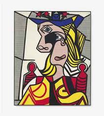
Woman with Flowered Hat, 1963
Christie’s.com
Lichtenstein had a long and successful career, and, yet he spent most of his time in his studio rather than wallowing in his success. In fact, his widow, Dorothy described him as being very reserved, the antithesis of the boisterous images he depicted. He had a set schedule each day, arriving at his studio at ten o’clock and leaving each day around seven o’clock. He followed a very routine life, he even preferred eating at the same restaurants. Dorothy also described him as working in a very steady way. “He used to say he aspired to become unpredictable and wild, curmudgeonly even, but it wasn’t his nature.” (Alastair Sooke, 2013, p. 7) That is probably why he was such a consistently successful artist. Lichtenstein’s success was not only in popularity but also monetarily. In 1970, Big Painting No. 6 (1965) was sold for $75,000. Nineteen years later, his painting Torpedos…Los! (1963) sold for 5.5 million. Posthumously his paintings continued to sell in the millions, and in 2013 his painting Woman with Flowered Hat (1963) was auctioned at Christie’s and sold for 56.1 million. Lichtenstein’s work has been acquired by several museum collections throughout the world. He has received many honorary degrees and awards, and he received the National Medal of Arts in 1995. Lichtenstein died of pneumonia at the age of 73 in 1997, his last words were: “Well, here I go.”

Lichtenstein’s rotating easel
LichtensteinFoundation.com
Resources:
Books:
Britt, David, Modern Art: Impressionism to Post-Modernism, Thames & Hudson Ltd., London, 1989.
Lambrecht, Laurie, Roy Lichtenstein in His Studio, The Monacelli Press, New York, 2010.
Lynton, Norbert, The Story of Modern Art, Phaidon Press Ltd., Oxford, 1980.
Marquis, Alice Goldfarb, The Pop Revolution, MFA Publications, Boston, 2010.
Rondeau, James & Wagstaff, Sheena, Roy Lichtenstein A Retrospective, The Art Institute of Chicago, 2012.
Sooke, Alastair, Roy Lichtenstein: How Modern Art was Saved by Donald Duck, Penguin Books Ltd., England, 2013.
Waldman, Diane, Roy Lichtenstein, Harry N. Abrams, Inc, NY, 1971.
Waldman, Diane, Roy Lichtenstein, Guggenheim Museum, 1993.
Websites:
ARTicle, Blog, Art Institute of Chicago
Biography.com
Churchwell, Sarah, The Guardian, February 12, 2013, Art & Design
Davies, Lucy, The Telegraph, February 5, 2013, Art
Smith, Roberta, The New York Times, 2008, Art & Design